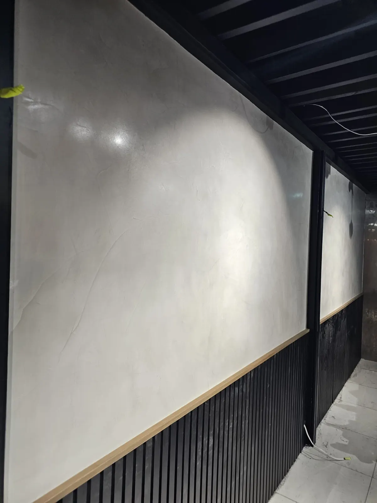
Choosing the right paint colour can completely change how a room feels, but the process does not have to be overwhelming. Colours can look very different depending on the light, surrounding finishes and time of day. The best approach is to take your time, compare your options properly and choose a palette that will continue to feel right long after the paint has dried.
Start With Your Room's Natural Light
Natural light has a major influence on how paint colours appear. North-facing rooms generally receive warmer, brighter light, while south-facing rooms tend to have cooler, softer light. East-facing rooms are brightest in the morning, while west-facing rooms receive warmer afternoon light. The same colour can therefore look completely different from one room to another.
Before committing to a colour, look at your room throughout the day. Check how your preferred shades appear in the morning, afternoon and evening, including under artificial lighting. A colour that works with your home's natural light will usually feel more consistent and considered.
Pay Attention to Undertones
Most paint colours have subtle undertones that can change how they appear in a room. Whites can have warm cream or cool blue undertones, while greys may lean towards green, purple or brown. Even neutral beige shades can appear warmer or cooler depending on the surrounding colours and natural light.
The easiest way to identify undertones is to compare similar colours side by side. Place several whites, greys or neutral shades together and their differences become much easier to see. Always consider a colour alongside your existing walls, flooring, cabinetry and furnishings rather than judging the sample on its own.
Test Your Colours Before You Commit
Testing your colours before painting the entire room can save time, money and disappointment. A small colour swatch often looks very different once it is placed against your walls and existing finishes.
- Buy sample pots of your two or three favourite colours.
- Paint large sample areas, ideally at least A3 size, directly onto the wall or onto white cards that can be moved around the room.
- Test your samples on different walls to see how changing light affects the colour.
- Leave the samples for a few days and check them in the morning, afternoon and evening.
- Compare your samples with your flooring, furniture, cabinetry and other fixed finishes before making your final choice.
Match the mood to the room
Colour sets the emotional tone of a space, so let the room's purpose guide you.
| Room | Mood to aim for | Often works well |
|---|---|---|
| Bedroom | Restful, calm | Soft warm whites, muted greens, gentle greys |
| Living area | Welcoming, sociable | Warm neutrals, earthy tones |
| Kitchen | Clean, bright | Crisp whites, soft off-whites |
| Study or media room | Focused, cosy | Deeper charcoals, moody blues |
Choose Colours That Work Throughout Your Home
Colours should work together from room to room, especially in open-plan homes and connected spaces. Instead of choosing completely different shades for every room, use a consistent white or neutral for ceilings, trim and connecting areas, then select a small range of complementary wall colours. Keeping similar undertones throughout creates variety while maintaining a cohesive feel.
Match the Colour to Your Home's Style
The style and character of your home should influence your colour choices. Heritage homes often suit warmer, deeper palettes, while modern properties can work beautifully with cleaner and cooler tones. Consider your existing architecture, finishes and furnishings when selecting colours so the final result feels natural rather than forced.
Understand LRV Before You Fall in Love With a Colour
Light Reflectance Value is the most useful number on a paint chip and the one almost nobody looks at. It runs from 0, absolute black, to 100, pure white, and it tells you how much light a colour bounces back into the room. Australian paint suppliers publish it for most colours, usually in small print on the back of the swatch or in the fandeck index.
It matters because LRV predicts how a colour will behave far better than your eye does in a showroom. Two greys that look almost identical on a chip can have LRVs of 62 and 48, and in a south-facing room that difference is the gap between calm and gloomy.
| LRV range | Reads as | Best suited to |
|---|---|---|
| 85 to 95 | Clean, bright white | Ceilings, dark rooms, small spaces, trim |
| 70 to 84 | Soft white or pale neutral | Most Sydney living areas and bedrooms |
| 55 to 69 | Mid-tone, clearly a colour | Rooms with generous natural light |
| 35 to 54 | Deep and grounded | Feature walls, studies, well-lit rooms |
| Below 35 | Dramatic, light-absorbing | Media rooms, front doors, considered accents |
Two rules of thumb worth carrying with you. In a room with limited natural light, staying above an LRV of about 70 on the walls keeps the space from closing in. And when you want trim to read as crisp against a wall colour, aim for a gap of at least 10 to 15 LRV points between the two, otherwise the contrast disappears and the detail is lost.
Why dark colours are hotter as well as darker
Low-LRV colours absorb heat as well as light. On an exterior wall in a Sydney summer, a charcoal render can run more than twenty degrees hotter than a pale one, which affects both the comfort of the rooms behind it and the stress on the coating itself. If you want a dark exterior, it is worth asking your supplier about heat-reflective formulations, which are designed to deliver a deep colour with a much lower heat load.
Sheen Is a Colour Decision, Not Just a Practical One
Most homeowners treat sheen as a durability question and pick whatever the painter suggests. But sheen changes the apparent colour substantially, because a glossier surface reflects more of its surroundings and less of its own pigment. The same colour in flat and in semi-gloss can look like two different choices.
- Flat and matt. Deepest, richest rendering of the colour, and the most forgiving on imperfect walls because it scatters light rather than reflecting it. Least washable, so it belongs on ceilings and low-traffic walls.
- Low sheen. The standard for Sydney interior walls. Holds most of the colour depth while tolerating cleaning. A reasonable default unless you have a specific reason to move.
- Satin and semi-gloss. Noticeably lighter and cooler in appearance because of the reflection, and unforgiving of any surface flaw. The right choice for trim, doors, skirtings and wet areas.
- Gloss. Maximum durability and maximum reflection. Striking on a front door or a heritage joinery detail, overwhelming across a whole wall.
The practical consequence: always test your sample in the sheen you intend to use. A sample pot supplied in low sheen will not accurately predict a semi-gloss trim, and this is one of the more common sources of disappointment once the job is finished. Which surfaces get which sheen is something we spec room by room as part of our interior painting work.
Building a Whole-Home Palette
Choosing one colour is easy. Choosing a set of colours that works across an open-plan Sydney home, through connecting hallways and into bedrooms, is the part that genuinely goes wrong. A simple structure makes it manageable.
The four-part scheme
- One ceiling white. Use the same ceiling colour throughout. It reads as architecture rather than decoration and removes a decision from every room.
- One trim white. Consistent across skirtings, architraves, doors and window frames. Changing trim colour between adjoining rooms looks unresolved, particularly where a door frame is visible from both sides.
- One main wall colour. This carries the hallway, living areas and most bedrooms. Choosing a single well-tested wall colour for the bulk of the home is the strongest thing you can do for cohesion.
- One or two accents. A deeper tone from the same undertone family for a study, a media room, a powder room or a feature wall.
The discipline that holds it together is keeping undertones consistent. A warm cream-based white on the trim next to a cool blue-grey wall will read as slightly dirty rather than crisp, even though both colours are perfectly good in isolation. Pick a temperature and stay in it.
Working with what you cannot change
The fixed finishes in a home outvote the paint every time, because there are usually more of them and they cost more to replace. Before you shortlist anything, identify the undertones in your flooring, benchtops, splashback, tiles, window frames and any stone or brick. Australian hardwood floors are strongly warm and will fight a cool grey wall. Grey-veined porcelain tile pushes the other way. Choose the paint to agree with the expensive things, not the other way around.
The same logic applies outside. Exterior colour has to work with the roof tile or metal colour, the brick or render, aluminium or timber window frames, paving, and the general character of the street. It is a much more constrained exercise than interior colour, and the fixed elements do most of the deciding. Our exterior painting service covers how those choices interact with the coating system, and our project gallery shows completed Sydney schemes in real light rather than on a chip.
The Mistakes That Cause Regret
- Choosing in the shop. Paint retailers are lit with bright, often cool fluorescent light that exists nowhere in your home. Never make a final decision under it.
- Testing too small. A postage-stamp swatch is overwhelmed by whatever surrounds it. Paint at least A3, and ideally an A2 area, two coats, on the wall itself.
- Testing on one wall only. The same colour will look different on each wall of the same room depending on which way it faces the window. Move a painted card around.
- Ignoring your light bulbs. Warm 2700K globes pull colours yellow, cool 4000K globes push them blue. Your evenings are lit by whichever you own, so check samples after dark.
- Copying an image. A colour that looked superb in a magazine or on a screen was photographed under different light, next to different finishes, and adjusted in editing.
- Picking white last. Whites are the hardest colours to choose because the undertone is all there is. Compare three or four side by side against your trim and flooring rather than assuming white is a safe default.
- Forgetting the connecting spaces. Hallways and stairwells usually have the least natural light in the house and are often chosen carelessly, then read as dingy against the rooms either side.
When colour is not the answer
Occasionally a room resists every colour tried in it. The cause is usually not the shortlist. It might be a lack of natural light that no wall colour can manufacture, a strongly coloured floor dominating the space, or a texture and finish problem rather than a hue problem. In those cases a decorative finish or a patterned wallpaper installation can solve what flat colour cannot, by adding depth and variation instead of another shade.
Frequently Asked Questions
How do I choose the right white paint?
Compare three or four whites side by side rather than judging one alone, because the undertone is the only thing distinguishing them. Warm whites lean cream or yellow and suit timber floors and heritage homes. Cool whites lean grey or blue and suit modern interiors with grey tile or stone. Always check them against your trim and flooring.
How big should a paint sample be?
At least A3, and A2 is better. Paint two coats either directly on the wall or onto white card you can move around the room. Small swatches are overwhelmed by the colours already surrounding them and consistently mislead. Leave the sample in place for a few days and view it morning, afternoon and after dark under your own lights.
What is LRV and why does it matter?
Light Reflectance Value measures how much light a colour reflects, from 0 for black to 100 for pure white. It predicts how a colour will behave in a room far better than your eye does in a showroom. In a room with limited natural light, staying above roughly 70 on the walls keeps the space from feeling closed in.
Should ceilings always be white?
Not always, but a consistent ceiling white throughout a home is the safest and most cohesive choice, and it reflects light back into rooms. Painting a ceiling in a soft tint of the wall colour can work in a room with high ceilings or a distinct character. In standard-height Sydney rooms it usually makes the space feel lower.
Do dark colours make a room look smaller?
They make a room feel more enclosed rather than literally smaller, which can be exactly right in a media room, study or powder room. The bigger practical issue is light: a low-LRV colour absorbs most of what reaches it, so in a room that is already dim the result reads as gloomy rather than dramatic.
How do I pick exterior colours that suit my home?
Start with what you cannot change. The roof colour, brick or render, window frames and paving will outvote the paint, so choose a scheme that agrees with them. Then consider the character of the street and the house itself, since heritage homes generally suit warmer, deeper palettes and modern builds handle cooler tones well.
Does paint sheen change how the colour looks?
Yes, significantly. Glossier surfaces reflect more of their surroundings and less of their own pigment, so the same colour looks deeper in flat and lighter and cooler in semi-gloss. Always test your sample in the sheen you actually intend to use, because a low-sheen sample will not predict a semi-gloss trim accurately.
How many colours should I use in one house?
A workable structure is one ceiling white, one trim white, one main wall colour carrying the hallway and most rooms, and one or two accent tones. Keeping all of them in the same undertone family, either warm or cool, is what makes the scheme read as deliberate rather than assembled room by room.
Get Expert Advice When You Need It
If you're unsure between a few colours, professional advice can make the decision much easier. An experienced painter can help you understand undertones, finishes and how different shades will respond to the light in your home. A second opinion can give you confidence before you commit.
Want help choosing a colour scheme that suits your home? Get in touch for a free quote and straightforward colour advice. We'll help you compare your options and choose a finish you'll be happy with for years to come.